A clickable high-fidelity prototype. Stringz is a digital project diary that helps users keep track of their various knitting, crocheting, and crafting projects.
The crafting community is large and diverse, yet there are not a lot of digital products on the market that meets the needs of users. I uncovered a chance to design Stringz, a digital project diary offering various tools of the trade that will allow crafters to better organize their projects.
The crafting community felt like they were being left out of the tech world when it came to digital technology. They no longer wanted old antiquated ways of keeping track of all their different projects. They wanted a new product with key features that could help them keep track of all those things in one place.
Through data-driven research and IA, I fleshed out the major frustrations of users to come up with the solution, a mobile crafting application I branded “Stringz”. A digital project diary that encompasses many of the key tools that users wanted in a new product.
I performed Competitive Analysis on three of the top knitting competitors on the market, Knit Companion, Love Knitting and Stash2Go. What I found most relevant was that although the various products had many offerings, none seemed to tap into the key features and concerns of the target audience.
While they all seem to encompass similar features, Stash2Go stood out most offering direct account syncing with popular third-party website Ravelry. Knit Companion focused more on designers by providing key technical support. However, their annual rate was very expensive. Love Knitting was a free option that offered a family sharing feature that was popular with users.
I conducted a User Survey. I needed to delve deeper into the yarn enthusiasts community to find out what users’ major frustrations, goals, and motivations were. The survey allowed me to check the pulse of users. Using conditional logic in my questioning to flesh out any potential new users.
What I discovered from the (113) participants over a 48 hour period was:
The survey brought back solid data and confirmed to me who my target audience would be, what their frustrations were and what they would like to see in a new product. I then moved on, and from my user data created Personas.

“Making beautiful things with strings is what I live for.”
Her biggest frustration is spending a lot of time searching the internet for dying supplies and needs a better way to catalog her stock. Her goal was to find a digital product that would allow her to keep track of all her supplies in one place.

“Knitting is my place of zen... it keeps me grounded.”
Her biggest frustration was juggling multiple knitting projects at one time and feeling unorganized. Her goal was to find a product that could help her organize all her unfinished projects.
Applying the data I gathered from research, I created User Stories to help me come up with a solution. Various roles were assigned to different stories. I prioritized what features should be included in an MVP based on user feedback:
User data indicated that simplicity was paramount. I created User Flows mapping out the paths to perform the various tasks. I always had it in my mind that I wanted to design something for a mobile app because that would allow the user to carry this product with them wherever they might go. I created eight user flows to show the paths:
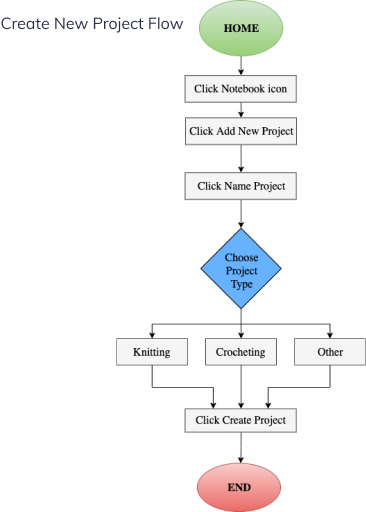
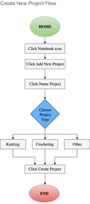
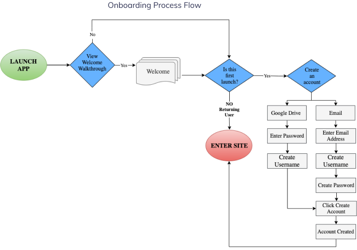
I created a content strategy document. This time around was easier to create this content because I felt like I had more background and knowledge into what I would want to see as part of my application. Although pulling together every word and all the content to create the interface for a mobile app is a large enough task, having been down this road before, I had more confidence doing this part of the process.
Putting together the Sitemap for the application I found a little easier to do this time as well. It still had its challenges because just when I thought I knew how I wanted everything to land or be placed, some new ideas would present themselves, (e.g., what content should flow to a separate page..., am I missing anything, etc?) I then needed to reconsider my original plan. Keeping focus was my main concern…, scope creep is real.

Site Map
Preparing the first sketches for the low fidelity wireframes was the next step in the process. I had a vision for what I wanted the UI to look like so I started on my sketch work.
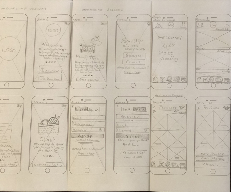
Wireframe Sketches
I then proceeded to create the digital Lo-Fi Wireframes. In the interest of time, I wound up not using the “Message Friends” and “Search for Local Yarn Shop” screens in the final solution. I iterated further on the wireframes before moving on to the branding phase of the process.
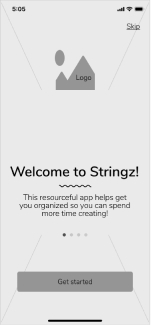
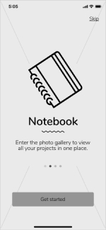
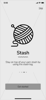
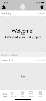
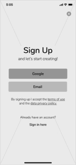
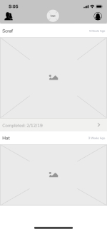
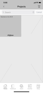
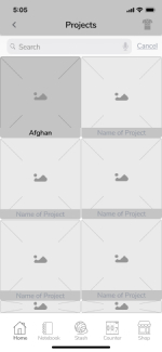
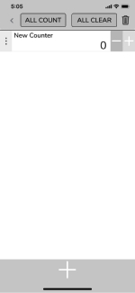
Lo-Fi Wireframes
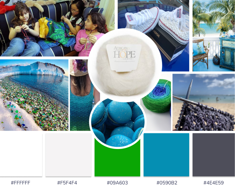
Creating the right inspiration for the brand was next on my agenda and very important to me. The colors, textures, and mood around this product would all reflect the brand’s story. A mood board was put together to help me visualize and bring forth my vision. Out of this inspiration, a color palette was chosen. The color palette represents the beautiful rich jewel tones of sea glass, invoking a feeling of simplicity and relaxation while knitting on the beach.
I wanted to make sure the brand’s name represented the product well. It needed to be something fun and I wanted it to have a different spelling. I branded the product “Stringz”. I used a “z” instead of an “s” as sort of a play on words. Once I settled on the brand’s name, I then began the task of sketching what I wanted the logo to look like. I wanted it to be something elegant and I wanted a ball of yarn to be represented in the logo as well. I did several different iterations:
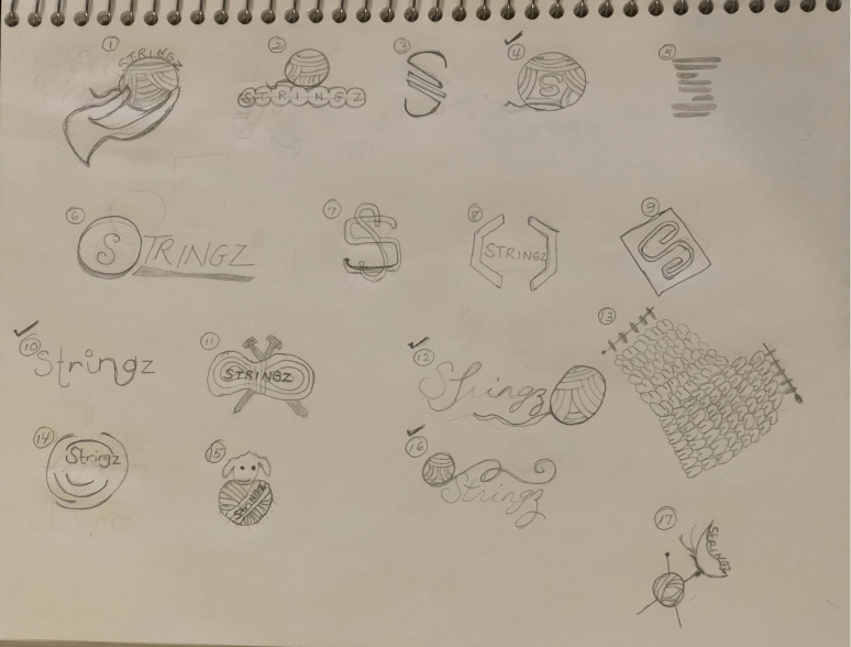
Stringz Sketches v.1
Preference testing was done to decide which sketches people thought would better represent the brand. I did a second round of sketches on the ones that were fleshed out for further iterations.
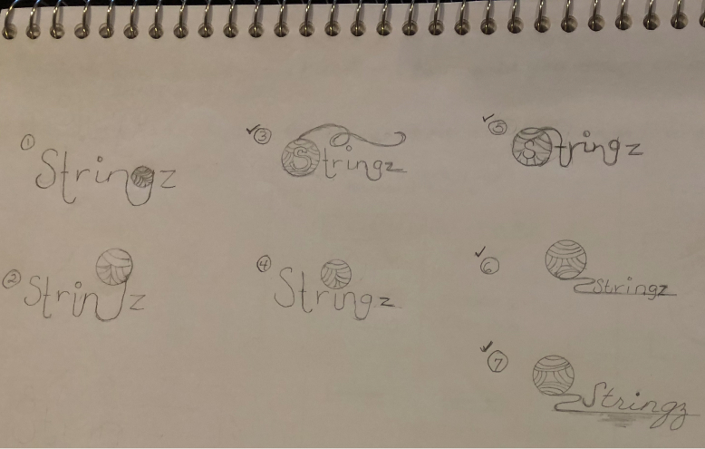
Stringz Sketches v.2
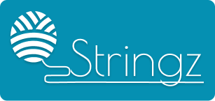
I created digital versions from the sketches. I conducted a preference test over 48 hours and had 123 participants take the test. Participants overwhelmingly (69%) selected logo B, which they stated was modern, had clean lines and was easy to read. Based on these test results, logo B is the logo I chose to represent the brand.
A.
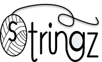
B.

C.




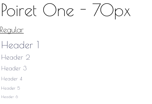
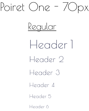
I chose to use the Poiret One type family strictly for the wordmark portion of the logo. The lines are strong and legible. This typeface has only one weight which is regular (400 weight) 70px, 82% line height.
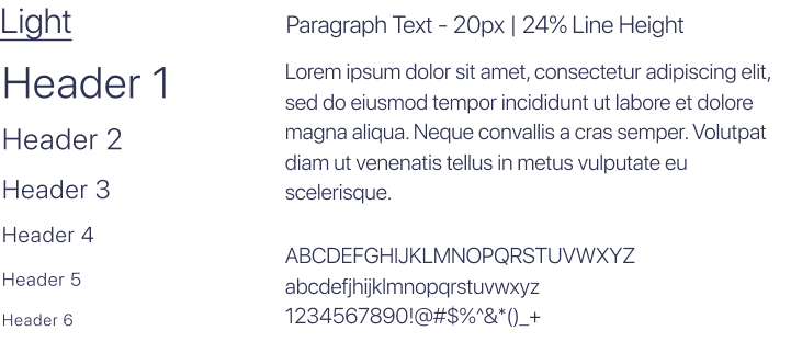
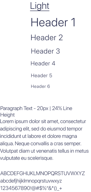
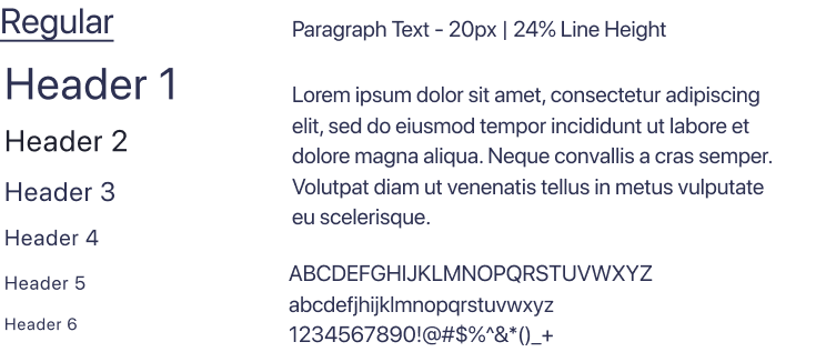
SF Pro Display type family was used throughout the entire application for labels, buttons, headers, body text, captions, etc. This typeface has several weigh classes, I used, Regular, Light and Bold. This font is an apple exclusive font.
Once the branding was complete, I went on to design the Hi-Fi Mockups.
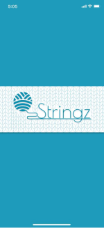
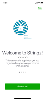
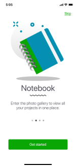
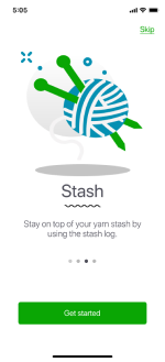
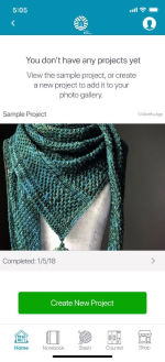

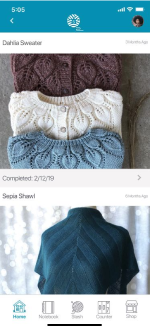
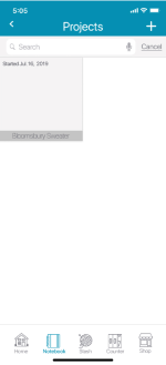
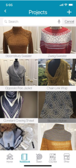
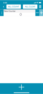
Hi-Fi Mockups
A clickable high fidelity prototype was created and usability testing was conducted remotely on three (3) potential users. Each participant was asked to complete the following five tasks:
My users included Shanté D. Powers, age 38, Psychiatric Social Worker of Coventry, CT, a busy mother of 3 children with limited time for web browsing, Valentina Vega, age 25, UX Design student of Los Angles, CA, enjoys spending time on social media when time permits and Sasha-Shae Weekes, age 32, Visual Design Strategist of Arverne, NY, a multitasker who spends a great deal of time on the internet managing her web business.
During testing, Shanté brought to my attention that the “add a photo” task would serve users better if an icon could be added to show users that they could add a photo to their newly added project. On the “edit counter” task, she stated that the ellipsis icon on the homepage would be more recognizable if it were positioned horizontally instead of vertically. She also thought the “Plus and Minus” buttons on this page could be larger, this could benefit users with certain mobility issues in their hands.
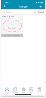
Iteration v.2
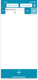
Iteration v.2
Finally, the on the “edit counter” homepage screen, Valentina suggested that I offer an empty state for first time vistors to help users understand better what can be done on this page. After all testing was completed, I went back to the mockups and redesigned the “Counter Homepage” screen to implement the changes fleshed out through testing.
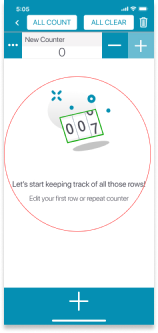
Iteration v.3
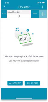
Iteration v.4
Being tasked with creating a Solo Project was a big undertaking. Searching the web for ideas, it came to me to make a product around something I’m very passionate about.., Knitting and Crocheting.
Once it was clear what direction I would take for the MVP, gathering research to find out what frustrations fellow crafters might have was key. I needed to better understand what this community felt might be lacking in the area of digital technology. As this was going to be my second time at creating a product from the ground up, I felt less hesitation to move forward. Taking each task one step at a time helped me keep things in a proper perspective. Scope creep is always lurking in the background for me.
What didn’t work for me was this need to always second guess my decisions. I always feel like I’m not doing enough, so I do too much only to find out it wasn’t necessary. I need to strike the right balance and trust the process. If I had more time for this project, I would have finished designing the other screens I omitted from my final solution.
What I take away from this process is that it is imperative when designing marketable solutions that the complexed nature of development should always be kept in mind when deciding what characteristics you want to showcase in your product, there may be limitations on what can be fully implemented.
What surprised me most with this project was just how eager users were for a product in the crafting market, and how my solution helped to address a few of those concerns. While research showed that the target audience was women, there is a niche group of men in this community and given the time I would have liked to explore that market further.