A research-driven cloud storage solution that solves user frustration concerning the security of their data. Collaboration and functionality were also put through testing with this hi-fi clickable prototype branded Vaultage.
There are many cloud storage products on the market right now. I was tasked as the sole UX Designer to come up with the next new thing that could offer users a different experience. The solution, a product design that addresses the initial pain points of cloud service users, and a product that can compete in an overly saturated marketplace as an MVP.
Users felt that their data could be vulnerable to outside entities when using a cloud storage application. Security was a huge concern for them. They also wanted the ability to multitask, colaborate and share data with colleagues. The client felt that with the right key features a new product could be competitve.
Through user research and information architecture, I designed a data-driven solution and put the high fidelity clickable prototype through usability testing. Through the testing process, I came up with the final solution which was branded Vaultage.
Researching the top three competitors to discover their marketing strategies, primary audiences, and differentiators, allowed me to take a behind the scenes look into the world of cloud storage. The market is saturated with this type of product, making this concept easily duplicated. However, Apple iCloud far exceeds Google Drive and Dropbox in advanced technology. Dropbox, however, offers collaboration through different media and third-party apps. Google Drive starts its users out with a whopping 15GB of free storage.
Pricing seems to be comparable between the three. They all share common features, a new product could definitely compete if they added certain features the others didn’t offer and kept their rates competitive.
Take away: More time with research could definitely be done in this area to flesh out more weaknesses that would allow a new business to produce an MVP that wouldn’t be so easily duplicated, giving them more of a chance to move to the front of the line.
Once I was familiar with who the competition was and how they positioned themselves, I conducted a Google Forms User Survey to find out the main pain points of potential users, also to see if people really had the stomach for yet another cloud storage product. I used conditional logic in my questioning to flesh out who potential users might be.
What I discovered from the (33) participants over a 72 hour period was:
Take away: I learned from this data sample that people are generally happy with the services they are currently using, but do have concerns regarding security, privacy, and usability. They also would like to see newer technology applied to a new product that’s not currently being offered in the services they now have. There’s definitely a target audience that stood out from the sampling. A new product that addressed some of these pain points could definitely compete.
View Full Survey
“I love the idea of being able to work on multiple documents simultaneously.”
Whose biggest frustration was lack of new technology which affected her ability to work more efficiently. Her goal was to find a product that offered her newer technology so she could work on multiple documents and collaborate with team members.

“Making sure all gateways to privacy and security are locked is my chief concern!”
Whose biggest frustration was lack of sufficient security in her current product. Her goal was to locate a new product that offered her greater security and privacy features.
Take away: Although 39% of the participants were men, it was clear that the other 61% were women who identified as either White|European American or Black|African American woman between the ages of 21-40. Creating these two personas help me identify further with who my potential target audience would be and how I could build a design based on user need and point of view.
View PersonasBased on data from my research, I created user stories with the goal of allowing users to perform the various task within the MVP with as few clicks as possible. I provided roles for each user story. From these various roles and data from the user survey, I created about 23 user stories in order of priority from high to low in order to come up with enough information to start the process of developing for an MVP.
Take away: What I took from this process of creating individual user stories for each task, is that while creating them it allows you to really connect with your step process and internally visualize how to you will bring this MVP into fruition using this data.
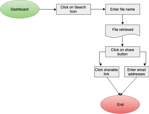
View User StoriesWith the MVP in mind, I then moved to create the user flows of the potential product. I visualized myself as the potential user performing the different tasks and how I could potentially get them done in as few clicks as possible. It was also at this time that I decided to design this product as a desktop website. I created eight user flows to show the following tasks:
Search | Share Files Flow
Onboarding Process Flow
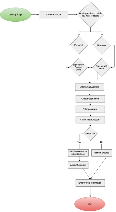
Take away: Creating user flows is an important step in the process. Walking through the steps click by click allows you to see where you can try to work smarter to complete the same task more efficiently.
View User FlowsWith the user flows finished, I started my draft content strategy document. The challenge I ran into was that, I never really put any thought into the behind the scene process of what really goes into the making of a website, just point, click and ta-da! This part of the assignment up to this point gave me the most angst.
I understood the premise behind the process of pulling together the “meat and potatoes” of each web page, but I struggled with the aspect of writing down every single word of the web page. So I pulled together the outline for my web content.
Take away: The challenge of pulling together content and laying out the structure of your website is a very critical part of the process that definitely needs careful thought. I adapted into this process as time went on in the project. Taking the time to build a strong blueprint at this juncture was key.
View Content StrategyThis is where I needed to visualize how I wanted things to be laid out. I needed to redefine a couple of things within the structure of the content document, like where I wanted hero statements to rest, and possible images that I might use, etc. Once I felt that I had nailed those things down I was able to move ahead.
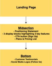
Site Map
Take away: Creating a sitemap for the website had its challenges, but I was able to overcome them by sticking closely to the content strategy document. At this point, it was real easy to have scope creep and veer off course.
View Site MapI began the work of sketching out my ideas for my low fidelity wireframes. I submitted them to the grading team for further feedback and received suggestions to help improve upon them before moving forward.
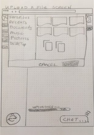
Upload a file sketch
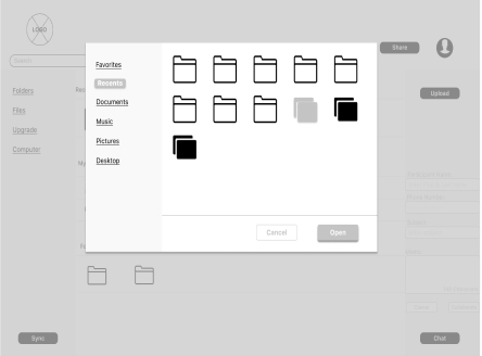
Iteration #1 – Lo-Fi Wireframe
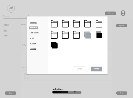
Iteration #2 – Lo-Fi Wireframe
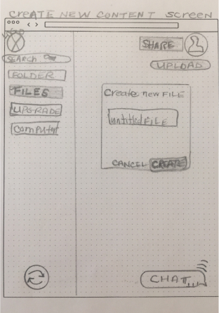
Create New Content sketch
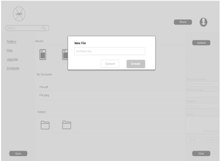
Iteration #1 – Lo-Fi Wireframe
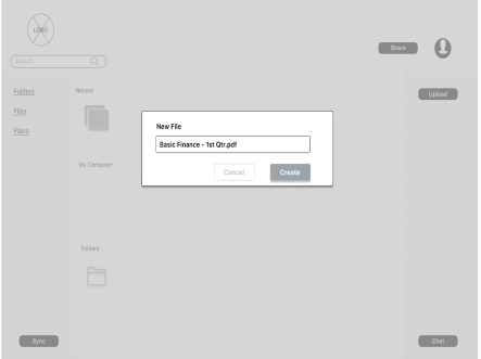
Iteration #2 – Lo-Fi Wireframe
After receiving feedback on the wireframes, I iterated further to make the suggested changes. I then produced a low fidelity clickable prototype. I conducted usability tests on three participants, two in person and one remotely to get their feedback. There were a few suggestions made requesting that certain things should be changed (e.g. information entered on the first signup screen should appear on the second signup screen without having to input the data a second time. It wasn’t clear if the “free plan” was actually free, etc). Overall the suggested changes to the prototype were minor. I made those changes and implemented them in the high fidelity mockups.
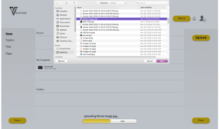
Iteration #1 - Upload a File
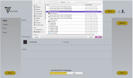
Final Version - Upload a File
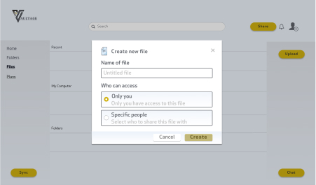
Iteration #1 - Create New Content
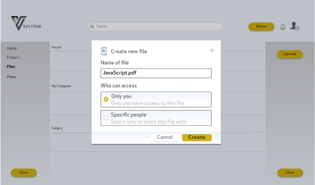
Final Version - Create New Content
I submitted the mockups to the DDC for further critique and received valuable instruction on how I could level up the design. I incorporated those ideas into the design then created a clickable Hi-Fi prototype for user testing. I used the same three participants for this testing as I did in the Lo-Fi user testing phase. They were excited to see the process go from unrefined to this now refined prototype and were eager to get started with testing. Testing went well. I summarized the results of the testing.
Take away: Ideation is important and necessary in order to push your product ideas to the next level. Also, frequent testing is definitely necessary to make sure your design ideas are transferring over to the users and addressing key issues.
View PrototypeIn order to bring out the visuals, characteristics and feel I wanted for this product, I started out with finding a name for the brand. Combining the two words vault and storage, I chose the name Vaultage. It reminded me of something that was strong, safe and trusted by most people. Moving further into the branding process, I began sketching out logo ideas for the design that would best represent the product. I came up with several ideas that I thought would work but chose the final version of the logo because I felt it best represented the strong vision I wanted this product to convey.
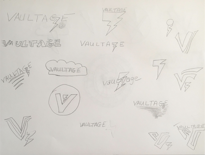
Logo Sketches


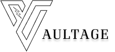


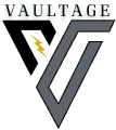
In order to get a further feel for the product, I created a mindmap. I needed to build out with words the structure that would best describe the characteristics and emotion of this product.
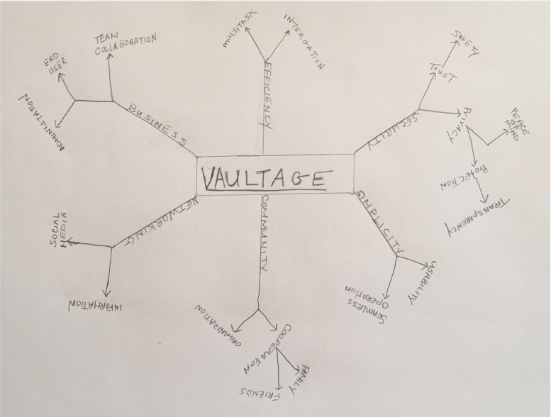
Mind Map
I also created a mood board to give me a sense of coloring, texture, feeling, and attitude around this product.

Mood Board
Finally, I produced a style guide giving the logo life through the brand story, design decision, use of the brand logo, color palette, mood, imagery, and typography.
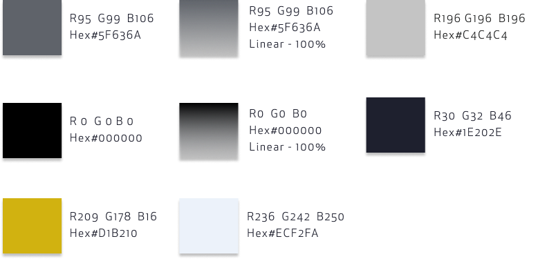
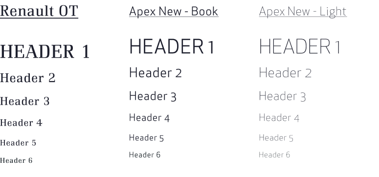
Having the style guide to work with, I conducted preference tests to give me feedback on a couple of the UI elements that needed further fleshing out. I created a couple of iterations for testing. I tested the login button style, progress meter color style and the radio button style. What I learned from the participants was:

– 62% preferred the login button without the solid black stroke around it, stated it “flowed with the rest of the CTA buttons”;

– 42% preferred the progress meter color that was the brightest shade of green, they felt it was the one they were most familiar with;

– 42% preferred the solid gray radio button.
Although 38% of people felt the login button with the stroke around it was an option, my final decision was to stay with the login button without the stroke. I did, however, change the final color on the progress meter to the brighter green color. I added in the changes recommended from the first wireframe usability testing and performed a second usability test before coming to the final version of the Hi-Fi mockups.
View Preference TestTake away: What I learned through this process is, in order not to be so conflicted with my choices, sketch out as many ideas that present themselves until that right image is evident. Visual design is very important, it will represent your brand. Working on these deliverables at each stage allowed me to bring my vision to fruition. Continue testing your ideas through user testing and preference testing. The final product should reflect your brand, and produce a product that has been user tested.
UX design has many parts and putting all those parts together to come up with a workable solution was challenging. I have grown a lot through this process and gained valuable insight into the design process. Having minimal information on a final product and no content presented its own set of challenges. I learned that what worked best for me was to knock it down one phase at a time and to just trust the process.
What didn’t work was to try and have it all figured out right from the beginning. A mistake I made and realized later was I didn’t necessarily follow my data with regards to who my target audience should be (women). I wanted it to convey strength and security, but at the same time be fun and inviting. I tested my solution on more men than women, and therefore I feel the design may have taken on a more masculine feel instead of feminine. The logo is very masculine, but in my mind, I saw “strong imagery” as noted by some of my testers. The young lady I tested felt that the site was “inviting and calming”, and thought the color choice was “spot on”.
If I had more time to work on this project I would have gotten more creative with some of the features that I offered in my solution. Data showed that some participants indicated that they would like to see newer technology used. Something critical that I found out from users is that even in this era of technology, there are still so many people who could care less about it and didn’t feel it was necessary for them to conduct their life functions.
In summary, what I learned through this process was that “yes…, I can do this”. No, it’s not perfection, but there is room for growth. I believe my final solution solves user's main concern of data security by implementing 2FA and adding more collaboration functionality. There’s much to learn to become a great UX Designer. While all things present challenges, if I don’t give up and continue to persevere, I can be successful in my endeavor. What surprised me the most, and what I truly didn’t understand, was the level of work it actually takes to produce an MVP.
I will use this experience and the knowledge gained through this process to continue learning, so I can be a part of creating wonderful user experiences for future product users.